What could be more exciting than shopping around for a luxury home? Easy – decorating one. Once you’ve found your perfect home, you can finally get down to the business of fixing your space in the style you want.
One of the things you need to think about is the color scheme of your new home. What vibe would you like it to convey? Warm, cool, or neutral? Do you want your interiors bright and expansive, or dark and cozy?
Here are some suggestions:
-
If you like it warm
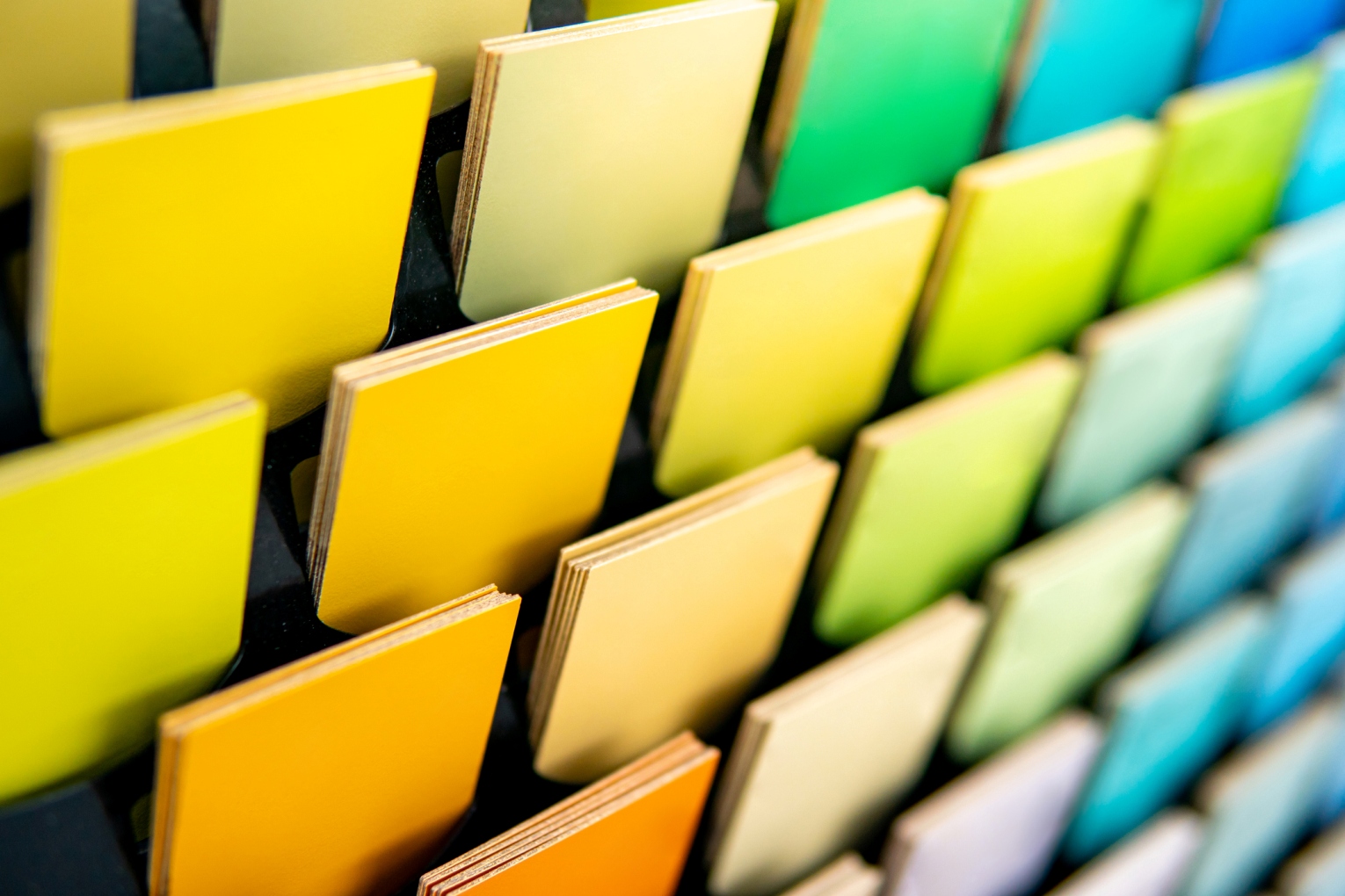
The spectrum of warm colors ranges from yellow to red. They’re vibrant social colors, conveying energy. In interior design, warm colors express coziness, meaning they tend to shrink the space of a room – an idea that often runs contrary to popular thought.
How to decorate using warm colors : If you can’t commit to painting all four walls your favorite shade of yellow, limit your warm color to an accent wall. You can also use the happy hues on your furniture – a red sofa, for example. Or on art, rugs, and other accessories to brighten up the room. -
If you like it cool
Cool colors belong to the blue and green spectrum of the color wheel. They evoke a sense of calm and remind us of elements like water and sky. While one generally associates this sort of tranquility with pastel tones, the rich, saturated shade of Pantone’s 2020 Color of the Year, Classic Blue, has been described as “comforting and relatable.” Note that cool colors tend to expand one’s perception of a room.
How to decorate using cool colors : Often used in contemporary homes, cool hues tend to come off as antiseptic and office-y. If you don’t want your place to look stark, balance your cool palette with warmer, complementary colors, especially in larger spaces like an open plan house. Again, furniture and accessories can do the job of providing lift and creating the cheerful pop or subtle contrast we all desire. -
If you like it neutral – but not boring
Neutral doesn’t mean just white or gray anymore. Neutral colors now encompass everything from something called aquatint to, yes, pink.
Think pink – seriously. Paint companies have called blush the “new neutral.” Instead of the lingering traditional associations people might have with the color, paint manufacturers say pink “captures the balance of optimism and calmness we desire at home.”
How to decorate using neutral pink: Paint makers recommend “glam accessories and artwork” against this “perfect backdrop.”
Beige is the new beige. While beige is often regarded as boring, it’s also the most versatile, functioning as a blank canvas against which your decorating choices can stand out. While displaced in recent years by the popularity of gray and greige, beige is back in a big way. Why? According to interior designer Cate St. Hill, “Beige provides that primal connection to nature; to when we had less – less worries, less pollution, less problems. The word itself comes from the French word of natural, unbleached wool.”
How to decorate using the new shades of beige: Employ texture to give depth – mix up materials like linen and velour, rattan furniture and distressed, bleached flooring. Combine gradations of beige like sand, camel, taupe, mushroom, or oatmeal and add accessories in other color tones like burgundy, peach, cobalt blue, and dark green.
California Lifestyle Realty offers luxury homes in La Quinta, CA, in both golf and non-golf communities. For the best choices, browse our listings. For more information, contact California Lifestyle Realty today, or call 760.501.0560. We’d be happy to help you.